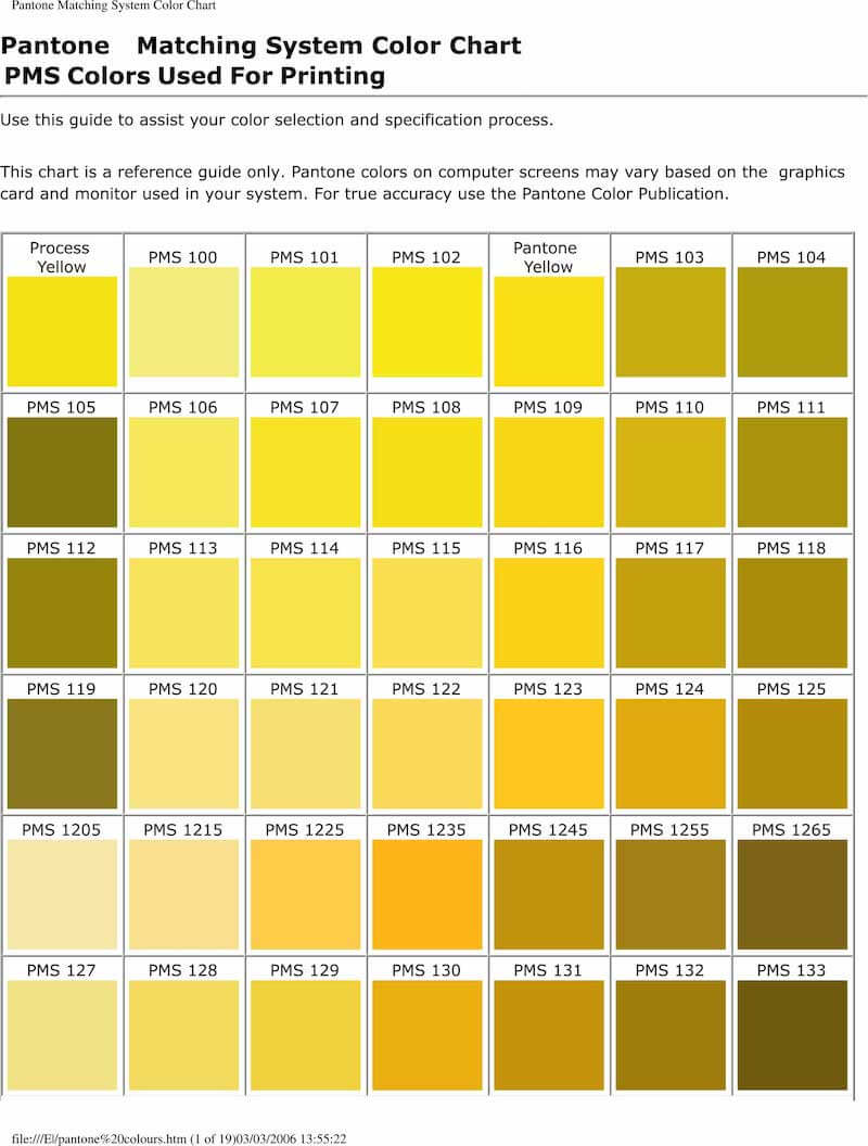
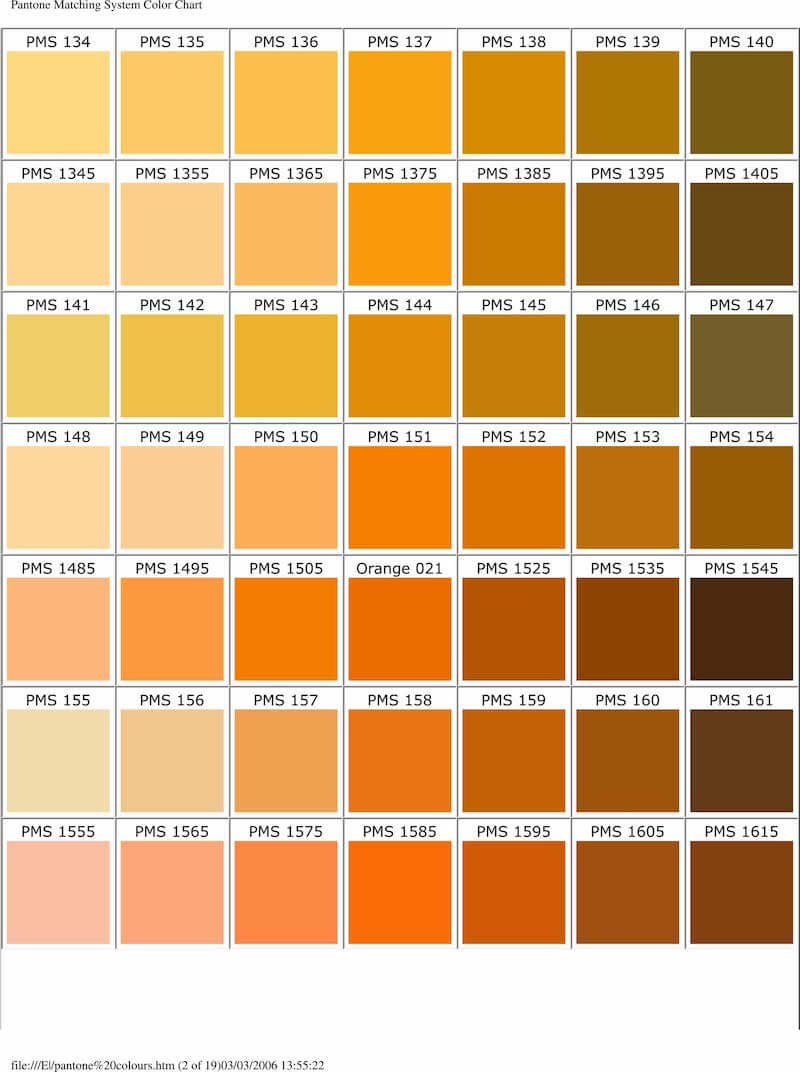
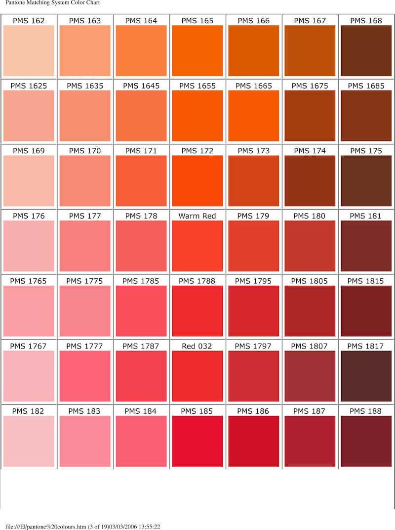
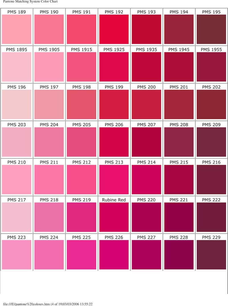
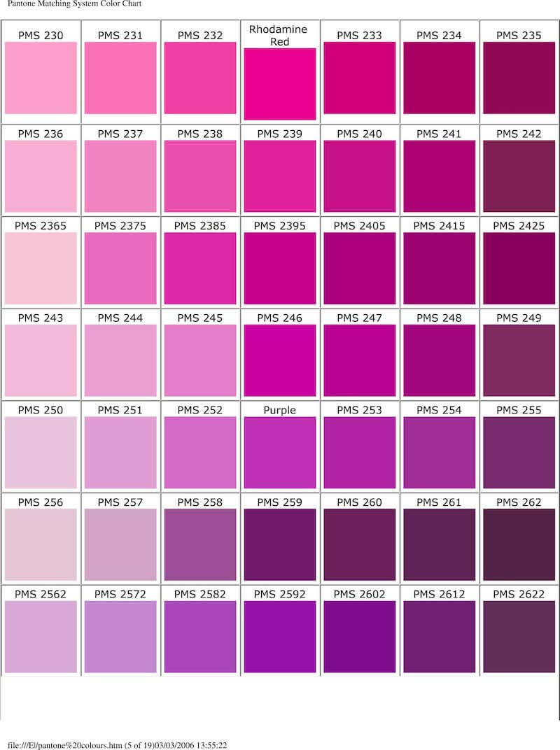
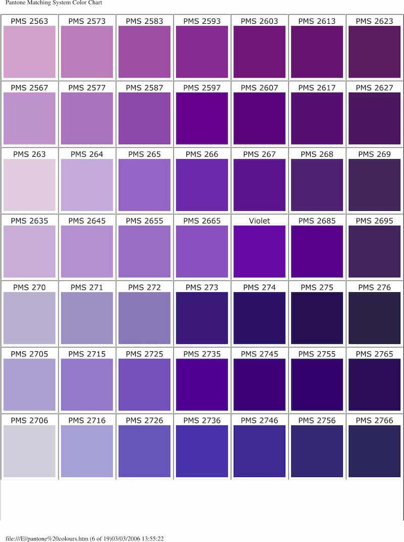
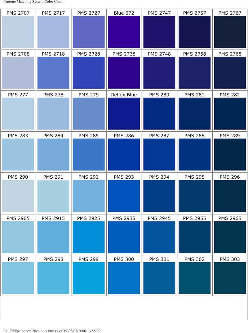
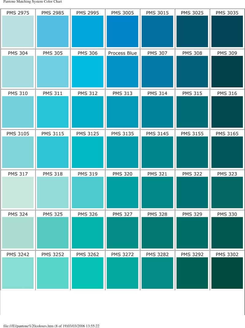
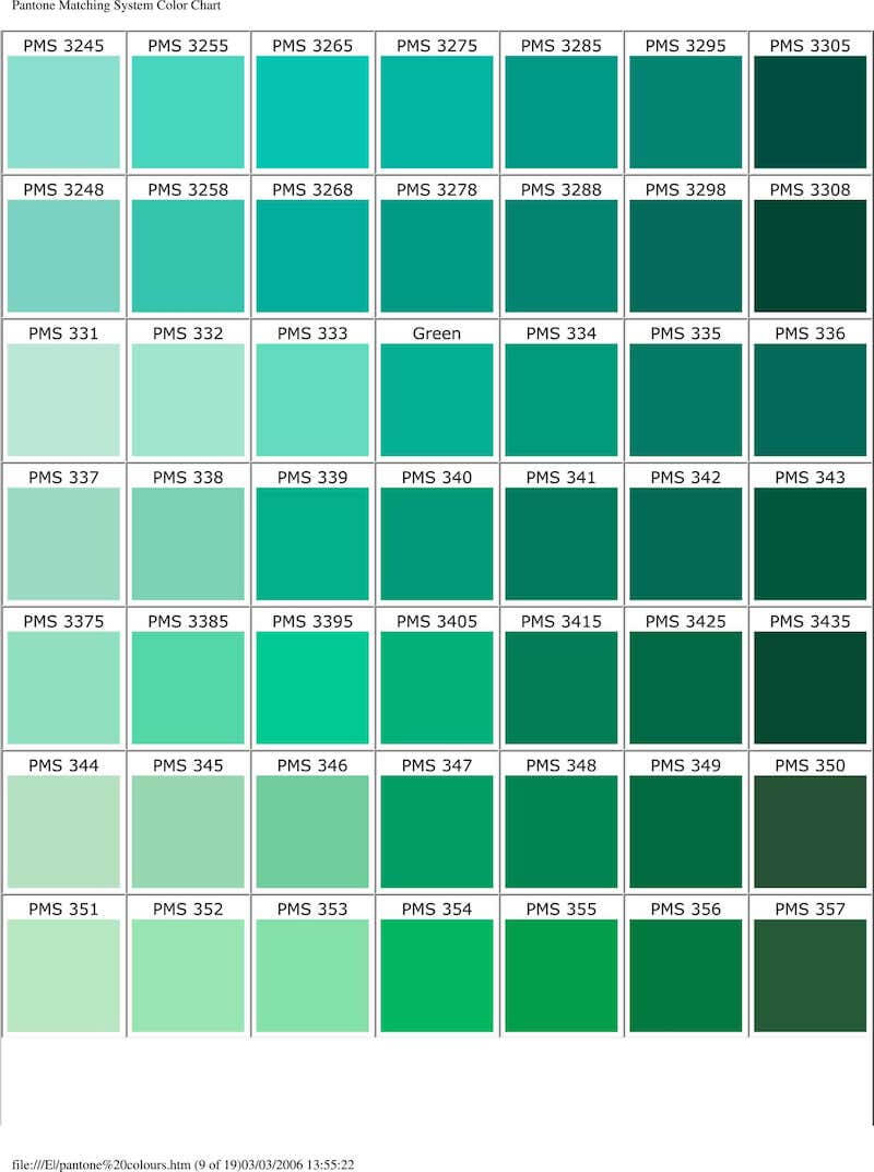
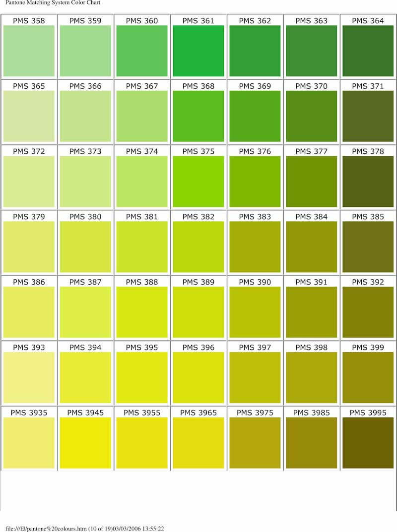
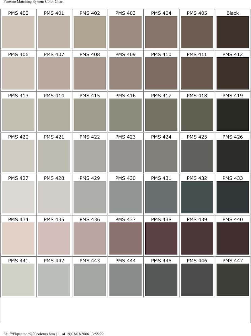
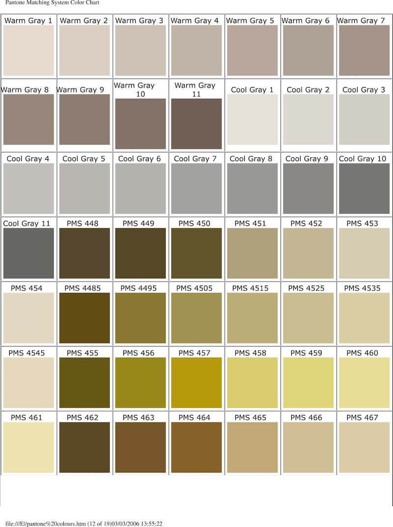
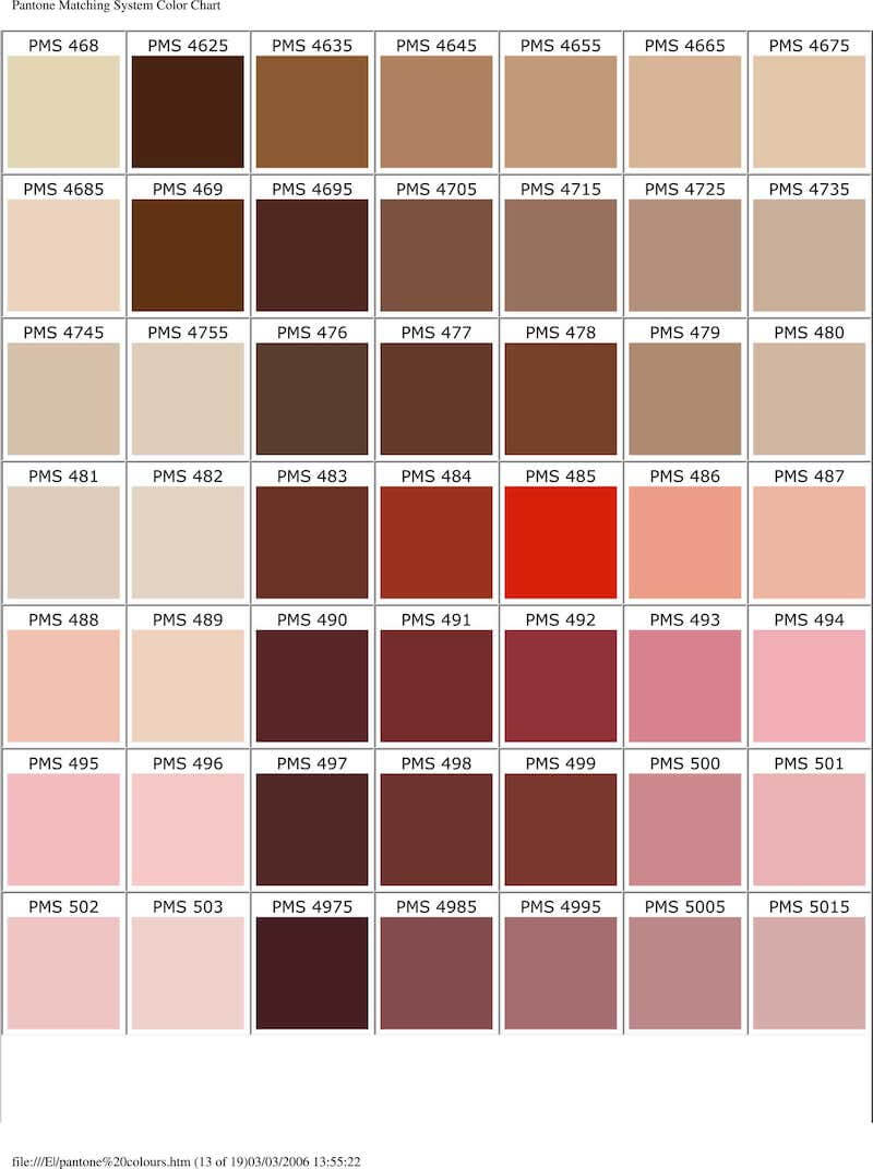
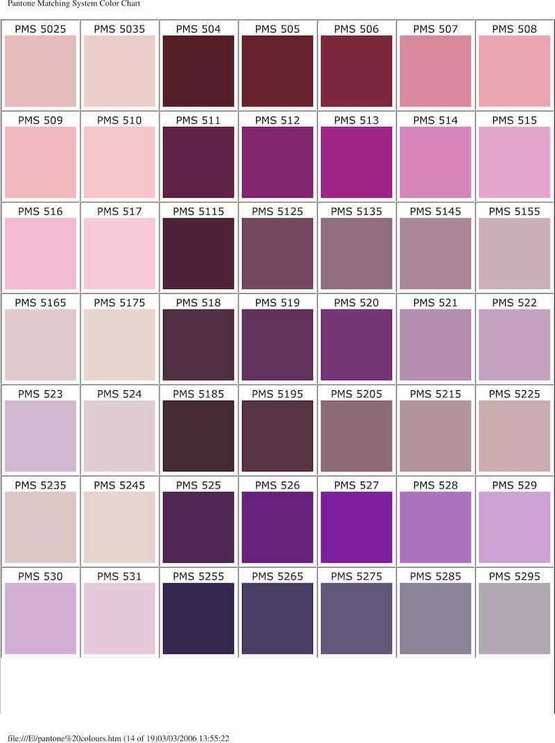
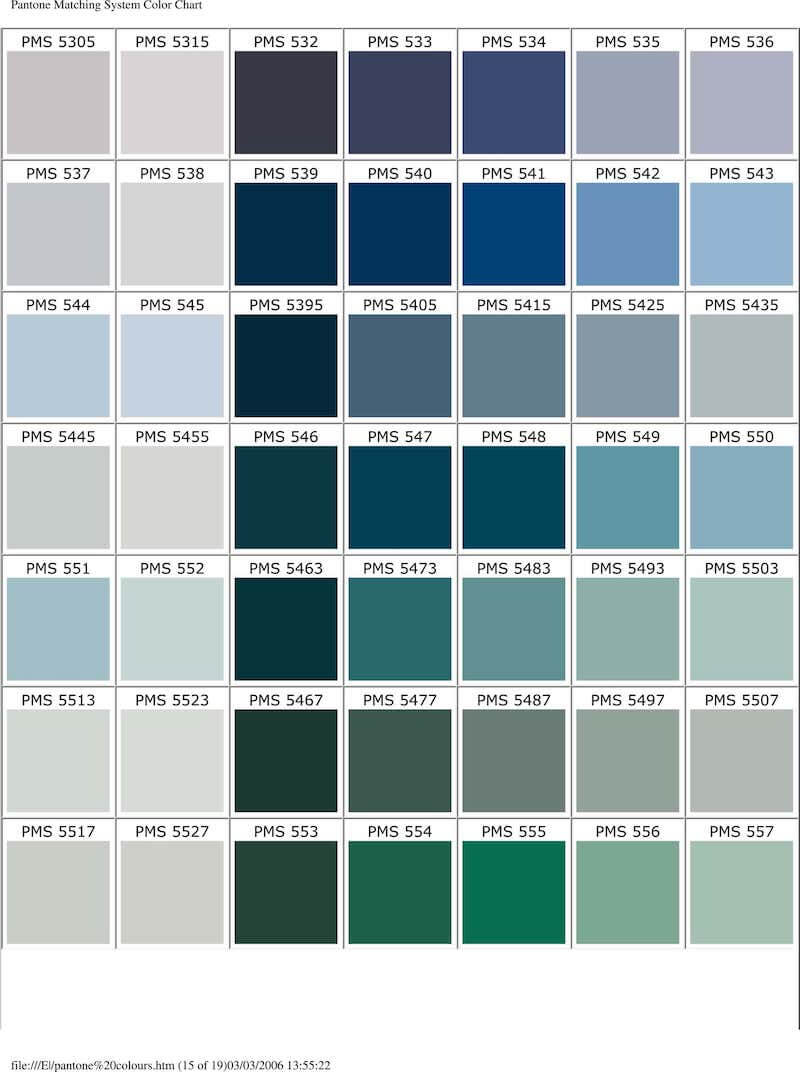
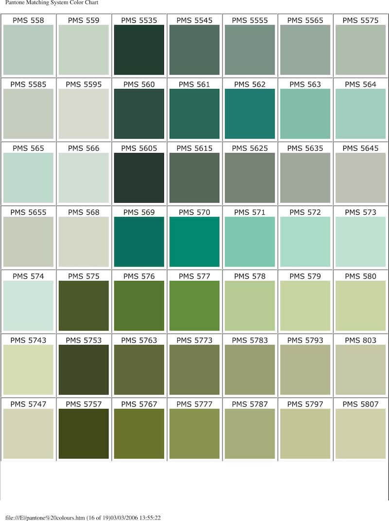
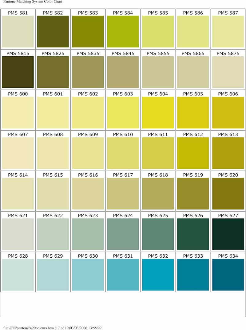
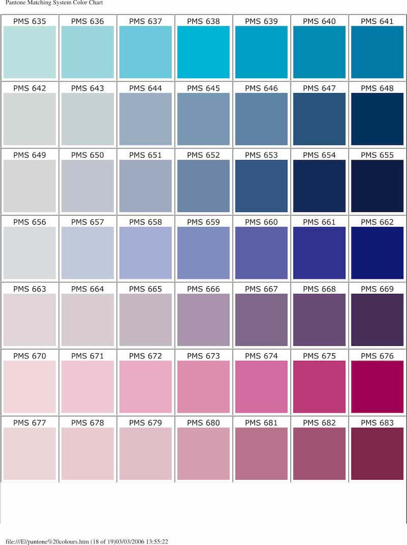
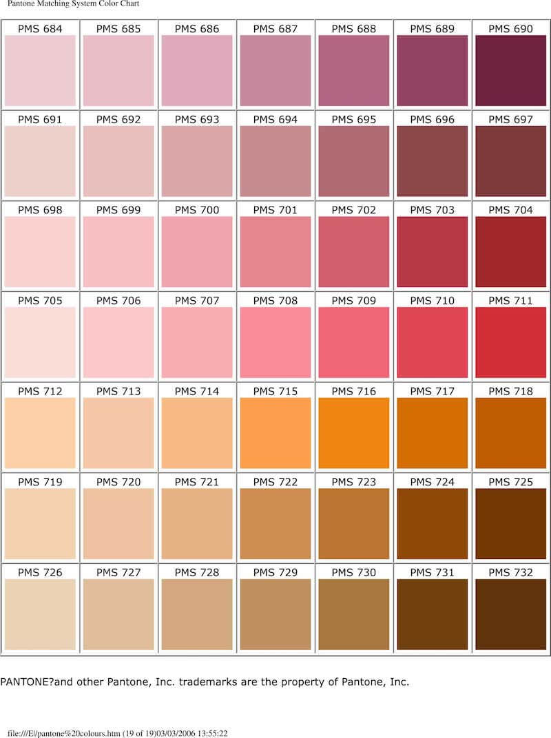
The Pantone Color Chart is an essential tool in the design, fashion, and printing industries, used to ensure color consistency across various applications. It’s a color matching system that Pantone LLC, a U.S.-based corporation, introduced in the 1960s. The system allows for precise color identification, communication, and replication by providing a standardized color palette.
Variations in the Pantone Color Chart
Classic Chart
The classic Pantone Color Chart includes a wide range of colors with specific Pantone numbers assigned to each. This system is primarily used in graphic design, packaging, and printing. Each color in the chart is identified by a unique alphanumeric code (e.g., PMS 185 C, where “PMS” stands for Pantone Matching System and “C” stands for coated paper).
Fashion, Home + Interiors (FHI)
The FHI color guide is tailored for fashion, home décor, and interior design, offering a different set of colors that are more relevant to these industries. It includes more nuanced shades and textures that are ideal for fabrics, furnishings, and fashion items.
Metallics
The Metallics color chart features a range of shiny, metallic shades that are used in various design projects to add a shimmering effect. These colors are often used in packaging, branding, and product design to create a premium look.
Pastels & Neons
This variation includes a range of soft pastels and vibrant neons, expanding the color possibilities for designers. Pastels offer subdued, soft shades, while neons provide bright, eye-catching colors. This chart is particularly popular in graphic and fashion design.
Color Bridge
The Color Bridge guide provides a side-by-side comparison of Pantone colors with their closest CMYK (Cyan, Magenta, Yellow, and Key/Black) process printing match. This is incredibly useful for designers to understand how a Pantone color will look when printed using CMYK inks.
Digital Solutions
Pantone also offers digital tools and apps, such as Pantone Connect, which allow designers to access Pantone colors digitally. This is particularly useful for digital design work and can be integrated with software like Adobe Creative Suite.
Conclusion
The variations in the Pantone Color Chart cater to different industries and needs, from digital design to fashion and interiors. Each variation is designed to ensure that designers and manufacturers can achieve precise color matching and communication, regardless of the project or material involved. Whether working on a brand logo, a fashion collection, or an interior design project, the Pantone Color Chart offers a comprehensive palette to work with, ensuring consistency and quality in color usage.
